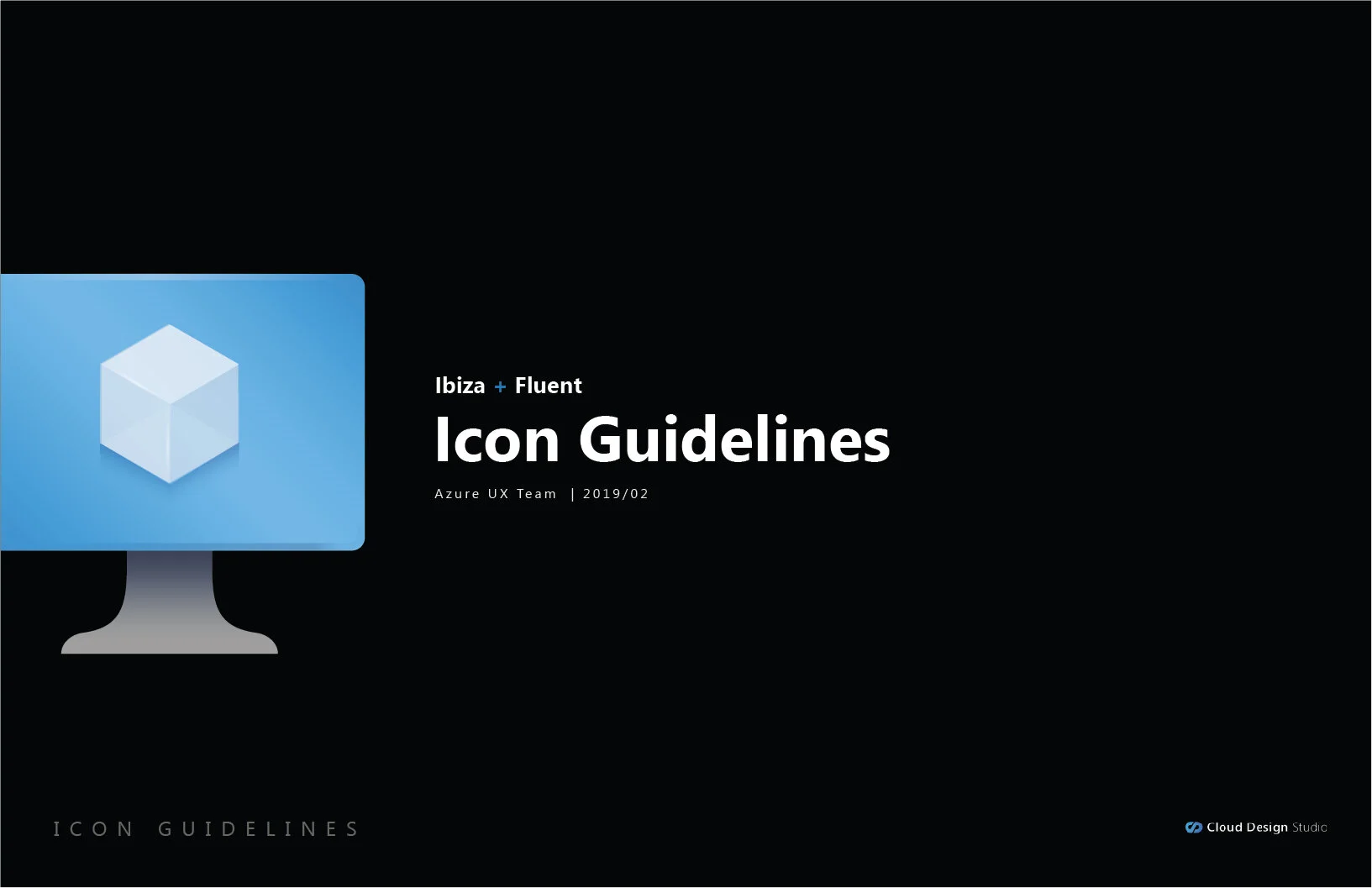
Azure Portal Icons

A HUGE opportunity and an enormous project
Approximately 715 million users are currently on the Azure Active Directory, and 85 percent of Fortune 500 companies use Microsoft Cloud in 2018.
Project:
I was asked to join a small team of consultants to review icon designs created by 6 different teams, and assess what they created and work with the Cloud Design Team to make a viable plan going forward.
My Role:
Evaluate the existing icons, assess strengths and weaknesses as an outside objective designer. Take what we could learn from those designs and create 24 icons that covered the base styles that the next 300+ icons would be based on. Develop a styleguide to make that easier for a team of designers to apply that style to create new assests.
Existing Portal Icons.

Project Challenges:
1: One set of icons that would work on all 5 Azure portal background colors. Black, White, Light Gray, Light Blue and Azure Blue.

2: We still needed to have enough contrast to hit a11y contrast numbers, of 4.5:1 though after much debate this was impossible to do on a all of the different background colors, so we were allowed to drop to 3:1
3: work at 16x16 pixels and at 128x128. Later on in the project it was decided a second set of SVG Icons would be made for marketing to use in promoting the new icons.
4: create a style guide that a team of V- designers could quickly extend the styling to 300+ icons that existed and a plan for new icons that would follow shortly after launch.
First Step: Review other teams work


These are just a few of the samples, there was some beautiful work many going in completely new directions and styles that were truly beautiful, I was unable to get releases to show many of them, but I was impressed with the work that was created. We quickly noticed that many of them looked amazning on dark backgrounds but had issues when moved to light or white background colors.
Grids and colors
Our next step was narrow down 5 icons to start with and a grid iterate on - this would allow us to look at where we started and how it would work on background colors and keep track of each step and the feedback we were given from the leadership on the Cloud Design Team, Marketing and the Azure Design Team.

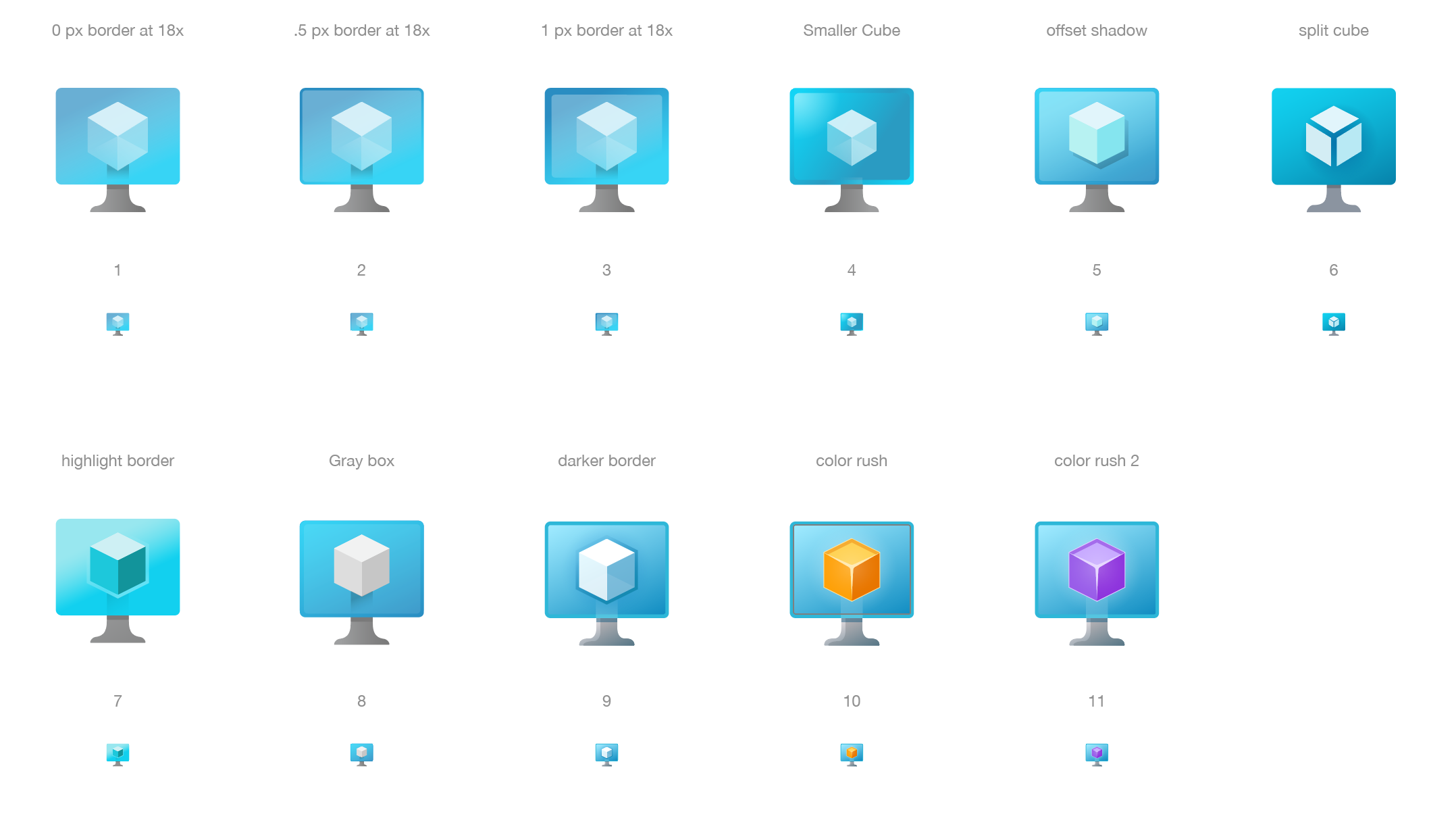
Iteration
Fast iteration with weekly reviews, taking feedback from a small team and then showing progress to larger teams at milestone reviews. 100s of variations were explored and reviewed. Colors, transparency trying to bring the Fluent styling into a icon deck. Scale was the hardest part at 16px not much of anything looks very interesting, but we were going to be allowed to build the icons as SVG files, so we could explore transparency, blends and color blends. This sent us down a lot of roads to see what might not be too distracting at 16px, but would look nice at 36 or 48px.

Things come to head
One of the interesting parts of working with company as large as Microsoft is there is never a shortage of leadership. As the design teams went back and forth on design styles, depth of shadows, highlights or no highlights ad nauseam. We decide a meeting should happen with all stakeholders, all the icon designers from France, all leadership, to date it will go down as the most expensive meeting I have ever been based on the hourly salaries of everyone involved.
After several hours of reviewing icons, one man stood up. His name was Leon he was Partner and Group PM Manager of the Azure Portal, he appreciated the time and expertise that everyone brought to the meeting. He said one thing that will stick with me the rest of my career, he said…
“We cannot afford for one person to come to the portal and not recognize the icon they are used to clicking on”
With that the meeting was over and our goal became to update the existing icons to be cleaner and “more” consistent but to not upset existing icons. Point taken and things proceeded much more quickly.
Style Guide
This our first style guide for this project, we went on to make some alterations, but this is what we developed. I would go on to be taken over by the Cloud Design Team, but this was the ground work for the rebranding of all 347 icons.


