Bot Framework Composer
Project Journey: Started in June 2018, this project marked my first experience with a Microsoft product from its initial version (V1). We began with a set of ideas, previous research, and a talented team. We launched the general availability (GA) version in time for Build 2020.
The Project: Our goal was to create a visual tool to simplify the Bot Framework SDK, enabling bot teams to develop ChatBots, Virtual Assistants, and other branded experiences. For instance, this tool was used to create a custom virtual assistant for a Bavarian car company.
My Role: I was responsible for creating UI, UX flows, translating whiteboard images into Figma, designing icons and color palettes, as well as the branding for the product once it went to GA, and reviewing all visuals before implementation. Additionally, I worked on A11y accessibility passes, collaborating with the Microsoft accessibility team to address all visual and UX challenges. I was part of a big team of UX designers, Conversation Designers, and Engineering teams across three continents—one of the most amazing teams I have ever been part of.


Often taking rough whiteboards and making them into flows using the existing elements we had decide to use. The expression that surfaced frequently through out this project was -
“We are building the plane,
while we fly it.”

With so many moving pieces there was a constant need to provide updates and communication to higher level managers and CVP level executives for bye-in and resources. More opportunities to simplfy complex products down to simple decks that could tell the story without getting to mired down in the technical nature of the build.
Research
While we knew ultimately what we building, what it could look like and how it would behave is still open for interpretation, each person on the team had a little bit of a different mental picture of how things would work and behave. So I was tasked with SWOT anaylysis of competition, similar types of software that incorprated code into a visual canvas.

UX Flows
We literally made thousands of different paths to integrate different behaviors or subtlties of the code stack we were trying to incorporate. Working in Sprints of 8-12 weeks we would determine the next engineering need and prep design to try to stay ahead of them. With people working in Seattle, Texas, New York, London, Beijing, Suzhou and Bangalore we had people working 24 hours a day on this product.
Challenges: One of the downsides of a 24 hour workflow is that decsisions get made while you are sleeping or away. With such limited design support in the initial stages we were often running behind, several engineering heavy flows were built without any design support. Utilizing Sprints and GitHub we were able to monitor work and integration into the Primary items were tagged as #designbugs and assigned to me to fix.

Visual Styling
Application design at Microsoft is based on the Fluent Design system (ideally), there are varied levels of implementation of this design system in different groups Azure, Power Apps, Dynamics all have all developed variations of this system based on the maturity of their product. We were working in conjunction a Dynamics Group who had branched out on their own to build their own design style guide, implementing a design system across several platforms in a WebApp and a Electron App involving three different organizations was an awesome opportunity.
Needless to say there were plenty of opportunities to debate what we should do.
In the end we are aligning to the Microsoft Fluent Web system as much as we can. In the coming iterations it will make some more jumps to be more and more polished as the product matures.


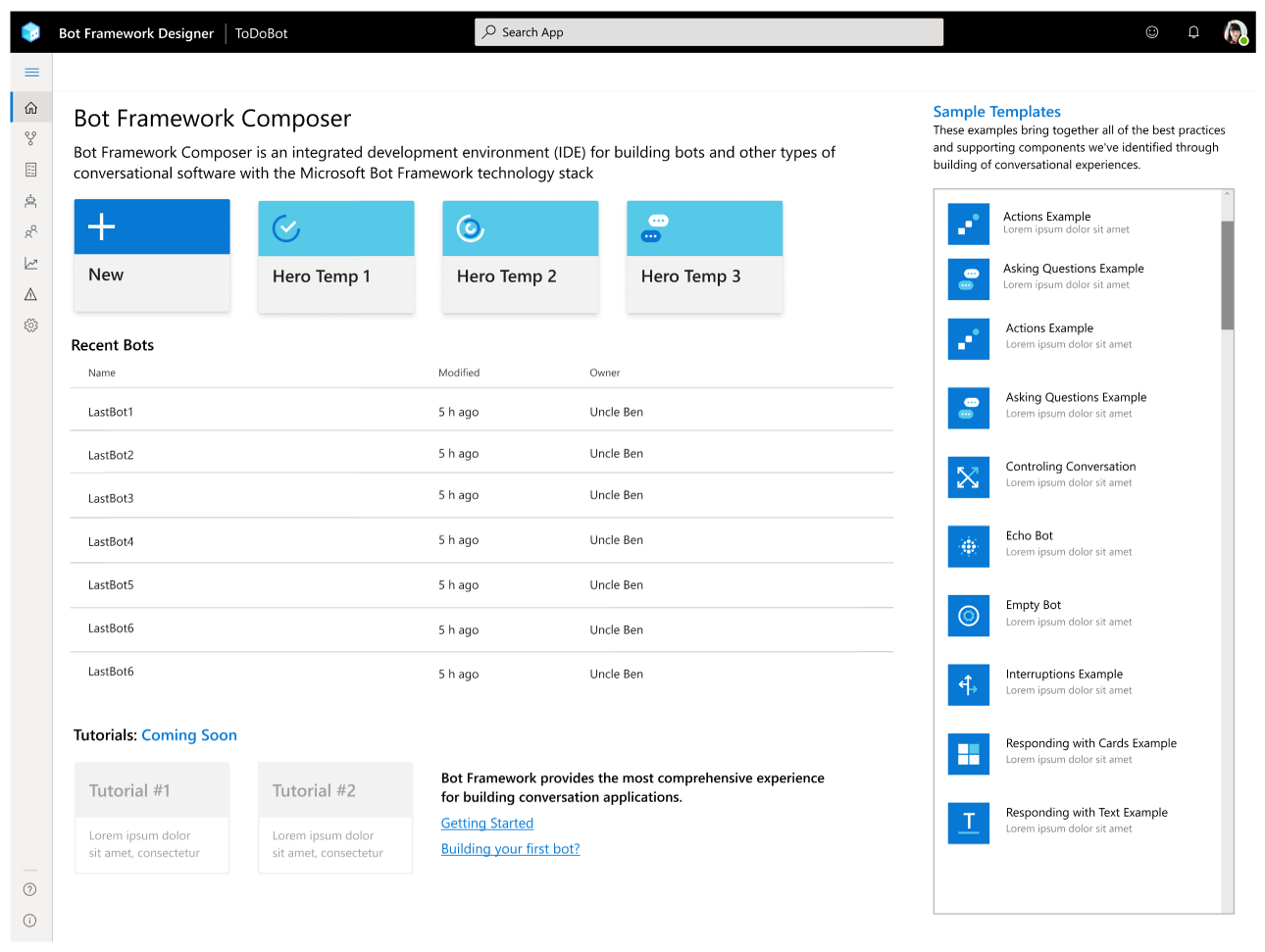
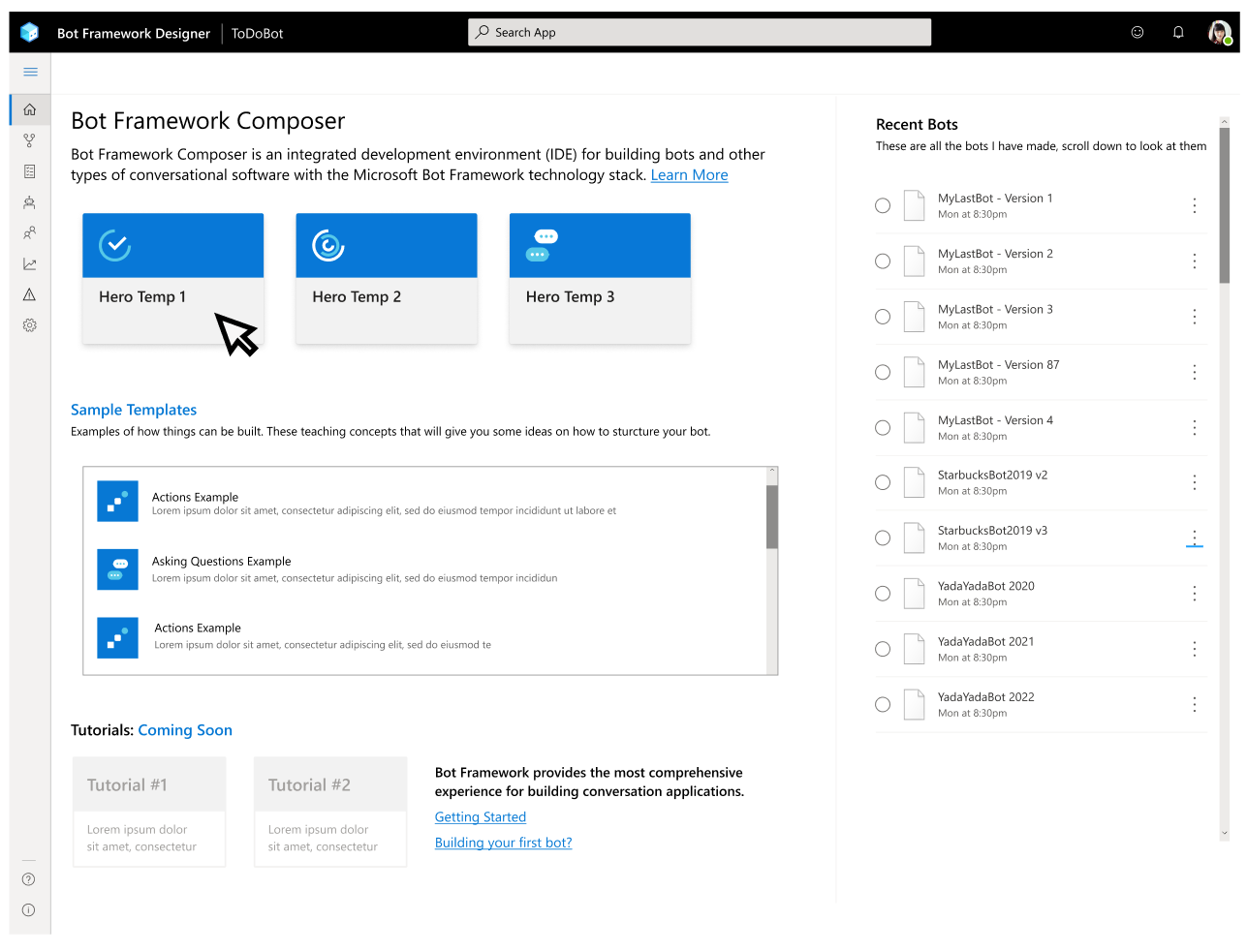
One of the challenges we have using a toolkit is that it is a very generic set of buttons and tools and not everything we need out of the box. So we have had to custom engineer a lot of elements and a lot of variations. For example we can look at just the homepage alone of our web app and the many style variations we tried.


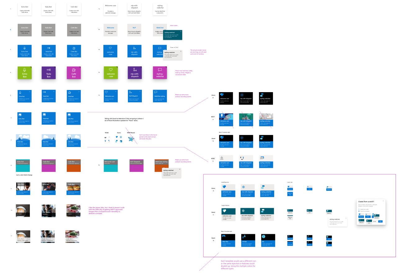
Iconography System
Icons have been a moving target with Microsoft for many years for the past several years we have used the Fabric MDL2 icons - that were based on monoline icons. Just in the last month a new version of Fluent Icons was released, and with the growing additions of more and more features we needed to do some organizing.

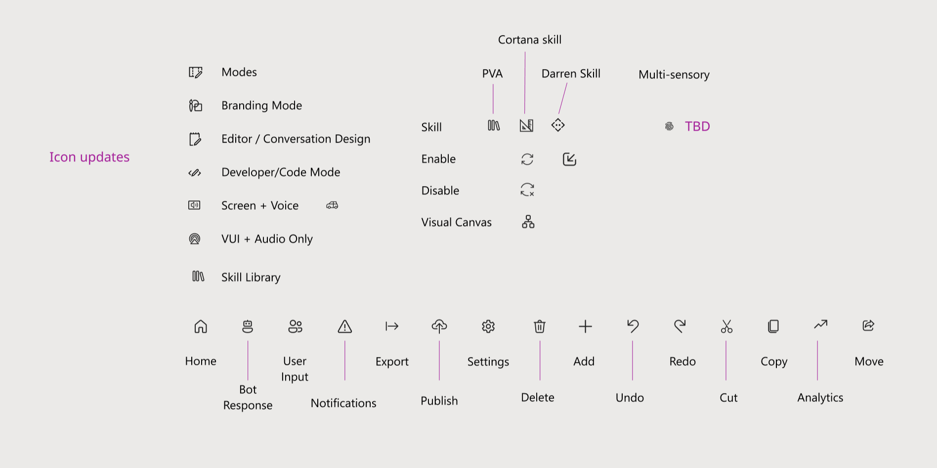
The Fabric Icon set is well over 500 icons, the Fluent update is only in the first several hundred, so this will be an ongoing process to keep things updated. I took this opportunity to minimize cognitive load of using fewer icons, condensing more items into drop downs.
The toolbar was getting full in some cases going completely across the screen - dropdowns and removing icons, enhanced consistency and speed of reading the navigation.

BEFORE

AFTER
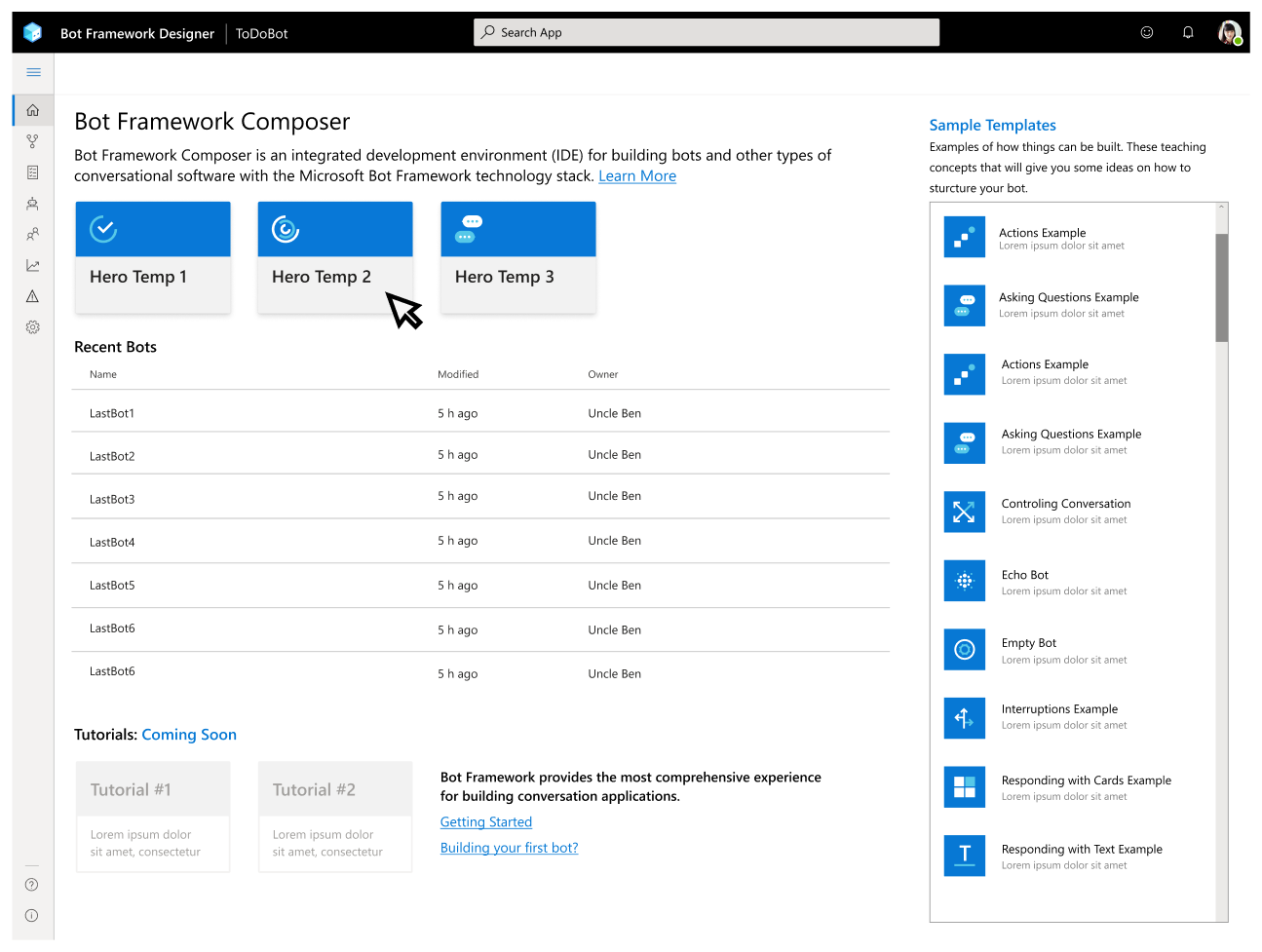
Onboarding
One of the more playful parts of this product was the onboarding experience, working with our amazing intern who was finishing her PhD in Human Machine Interaction we put together a walk-through that would quickly run a new user through the different elements of the app and where things could be found.
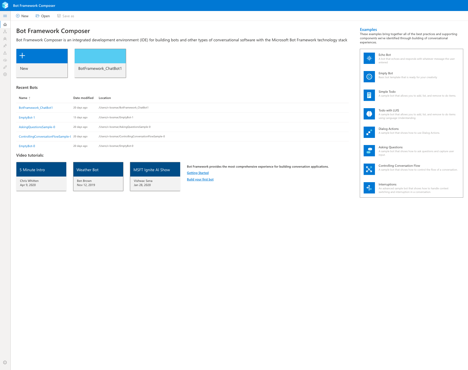
Entry points were through the Home Page selecting a Sample Bot, Creating a New Bot through the Create Wizard or those coming into Composer from Azure Portal Create Blade. A simple modal system was used that could direct users through the flow. With in the App Settings it could be stopped and started, as well as a progress chart of what they had done and how much was left todo.
This gave me a chance to do some illustrations and App Settings icons, just to give it a bit more fun and color.


A11Y Accessibility
This was my third product to run through Accessibility checks and with new Fluent and React elements we had fewer issues. With the addition of a visual canvas for making bots this introduced a very complex addition for accessibility, since by it’s very nature it is a visual tool. We were able to work through solutions with audit team that involved using a “tab” pattern that had been used on other Microsoft products.
Tracking of these items was all done on GitHub, we were given their UX experience, test environment and steps they used to Repro the event. Along with links, and screen grabs of the issues. It is a rather enjoyable process of working through how to best solve the issue.
I do feel that we are not making great applications for anyone when we are trying to make them everything for everyone, but trying to maintain multiple different products for all of the different accessibility issues is just as daunting for a small product team.
Example Issue

For example in this issue we had 3 different engineers build all four of these pages, and we had some confusion on what was supposed to be labeled as a header for the page and they all did a bit of freelance on how that would be visualized and they all need to be assigned a the first tab position so they could be read on a screen reader in the same way.
SOLUTION

Branding and Marketing
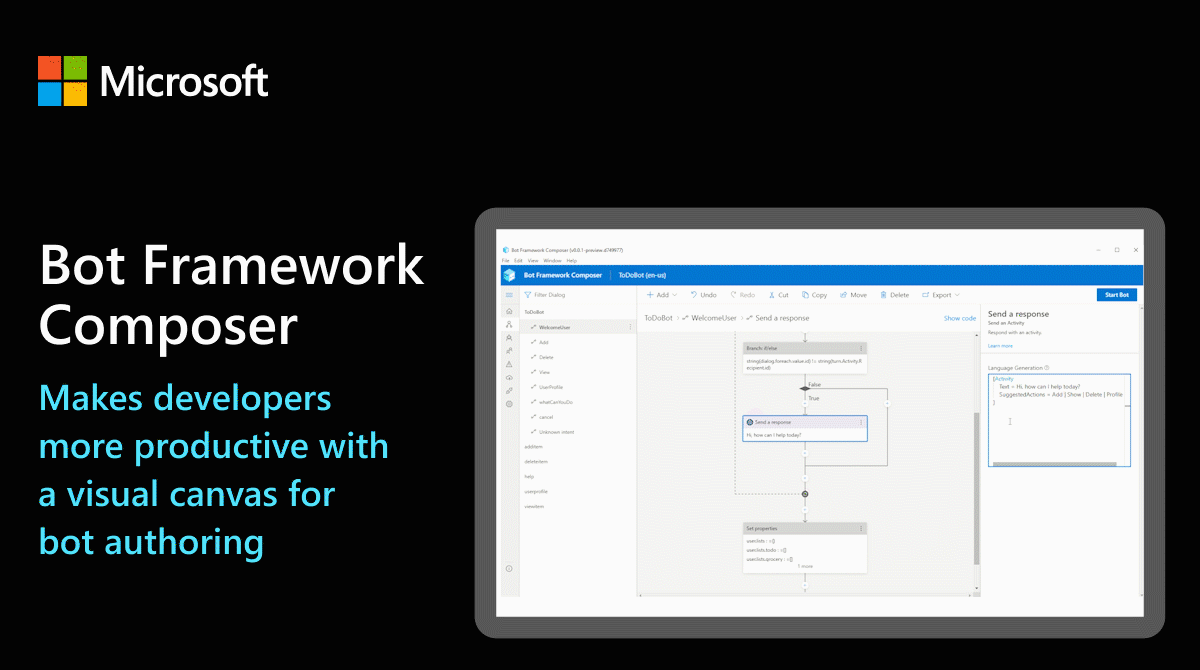
Challenges turned into opportunities. With the timing of our product launch and the speed at which we created it there wasn’t time to turn to Microsoft Marketing Team for help. I was given the opportunity to brand our product and do as much marketing as possible.
The icons for Bot Framework I had unknowingly made before I joined the Bot Framework Team - <See Azure Icons>
So using the same styling and grid I rotated our icon into a isometric “robot head”, this was one of those

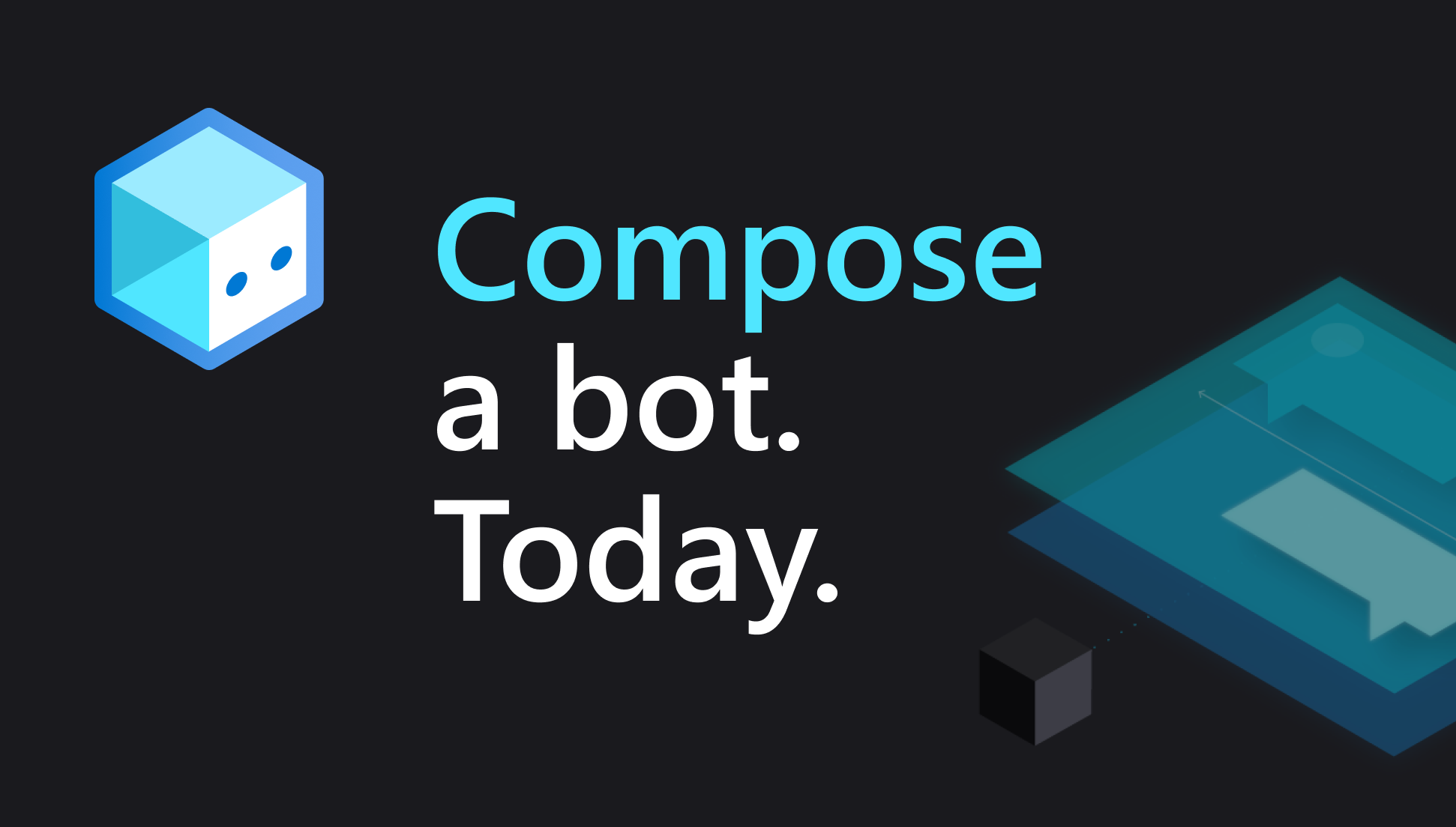
Bot Framework Icon

Azure Bot Services Icon

Bot Framework Composer Icon
Web Banners


Animated Gifs

Videos for Homepage and Youtube
I started a YouTube Channel to keep our tutorials and allow us to keep update our clients on the new features, that are difficult to understand in a mountain of document files. Using After Effects, Garage Band and Premier Pro I was able to alter some stock audio and animations to build a consistent experience for all of our videos.


SWAG and Promos


GitHub
All of the Bot Framework products are available on GitHub, so we keep a 24 hour prescense on the website aligning all of the headers to be a “Branded Family” without stepping on any official Microsoft Branding guidelines.
