Quorum Software
Project:
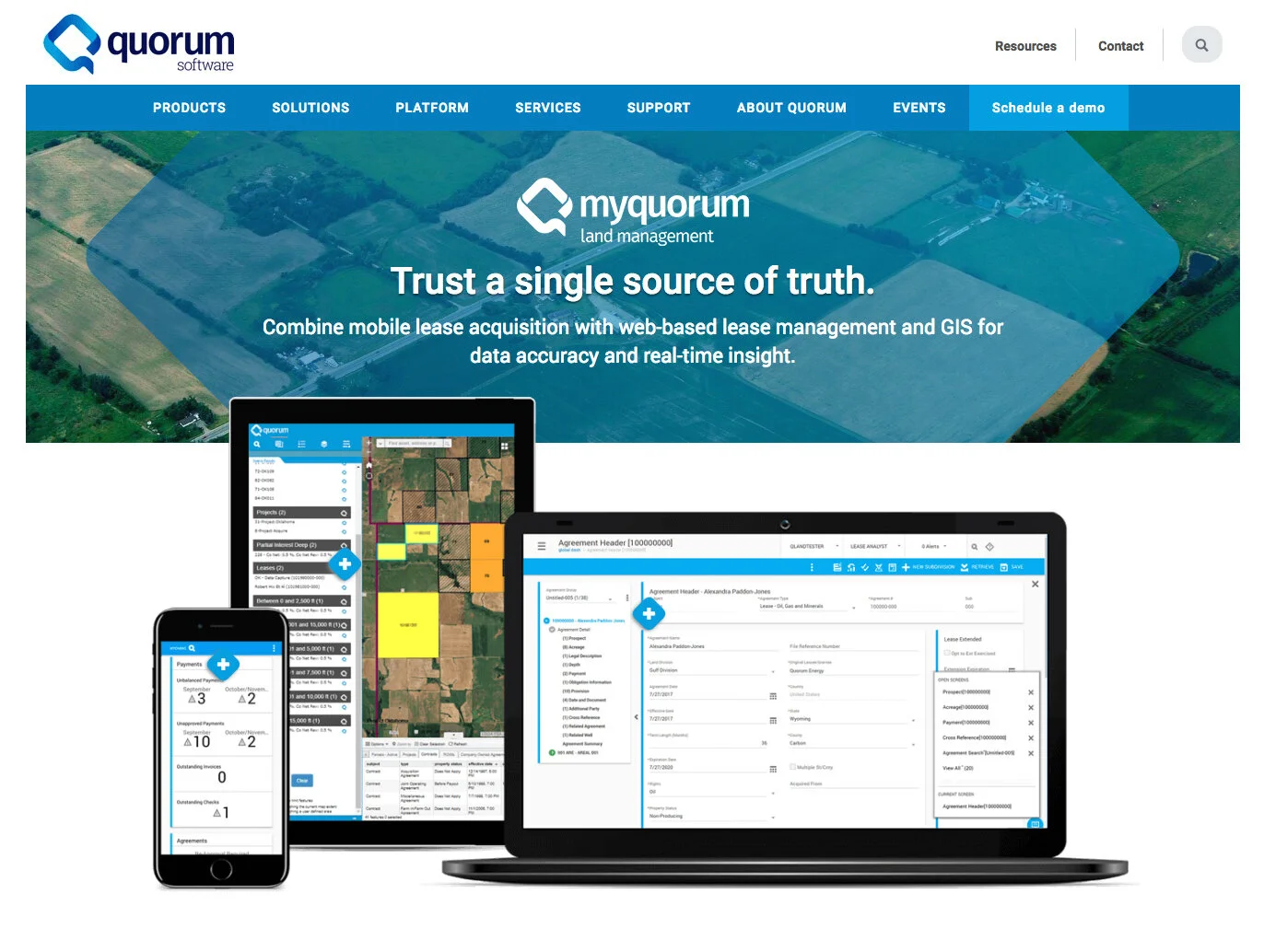
Revamp website and mobile app of a software company that is providing realtime anayltics to very “loose” industry.
My Role:
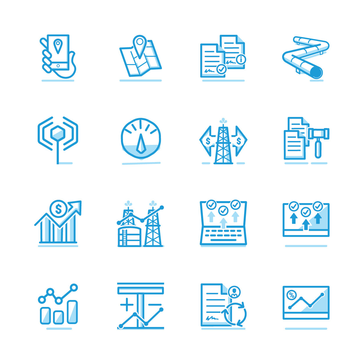
I provided real-world knowledge of the oil field supply chain to a digital agency in the Pacific Northwest (PNW) that lacked experience in this industry. The agency initially approached me to develop icons based on industry-specific visuals, which previous illustrators had struggled with.
Having worked extensively with energy companies, I possessed the necessary vocabulary to effectively communicate with the client and understand how their target audience would interpret the content. We started with a set of 24 icons, but it quickly expanded to over 60, which became excessive. In addition to icon creation, the project also involved assisting with the design and development of website pages.
During this collaboration, I successfully created a total of 68 icons for Quorum Software. It can be challenging to advise against creating too many icons, especially when the client is compensating based on the number of icons produced..
This site is very large, and the flows seemed to go on and on. It is still live and still uses most of the original content, though it has been simplified. In one of the many meetings we were in I made the suggestion that at somepoint the sheer number of icons started to become difficult to parse, too much of a good thing.
I’m happy to see that they are using less of them in the current version
www.quorumsoftware.com
Desktop Version of Site
Mobile


